The Influence of Color Psychology on Efficient Storage Design in Minimalist Spaces
Exploring the Impact of Color on Design Choices
Color is not merely a visual component; it significantly influences our psychological reactions and behaviors. In the domain of efficient storage design, particularly within the framework of the minimalist movement, the choice of color can radically reshape a space’s ambiance and functionality, impacting mood, perception, and how we engage with our surroundings.
Why Minimalist Spaces Matter
Minimalist spaces focus on simplicity and functionality, deliberately removing unnecessary elements to create a serene and purposeful environment. This approach yields several benefits:
- Clarity: A minimalist design fosters a clear environment, allowing individuals to focus on the essentials. By reducing visual clutter, these spaces enable better concentration and decision-making.
- Efficiency: Every item in a minimalist design serves a purpose, enhancing usability. This thoughtful arrangement not only organizes but also simplifies everyday tasks, making them more efficient.
- Calmness: The reduction of clutter contributes to a tranquil atmosphere. Minimalist interiors often evoke feelings of relaxation and peace, encouraging mindfulness and mental well-being.
The Role of Color Psychology
Incorporating principles of color psychology into storage solutions can greatly amplify both aesthetic charm and emotional comfort. Different colors can evoke distinct emotions and improve the functionality of a space. For instance, consider the impact of:
- Blue: Often associated with tranquility and reliability, blue hues can create a calming effect, making them ideal for home offices or study areas where productivity is paramount. A soft blue wall can reduce stress and enhance focus.
- Yellow: This vibrant color is known to inspire optimism and stimulate creativity. Incorporating yellow accents—such as storage bins or wall art—can bring a sunny disposition to a workspace, encouraging innovative thinking and a cheerful atmosphere.
- Green: Representing nature and balance, shades of green promote a sense of harmony. Utilizing this color in a minimalist space can create a refreshing environment that improves overall well-being while enhancing organizational efficiency.
By exploring how these colors interact with minimalist design, individuals can create innovative spaces that not only serve as effective storage solutions but also elevate the overall living experience. As we continue to examine the synergy between color psychology and minimalist design, it becomes evident that the transformation of ordinary spaces into efficient storage havens can lead to enhanced lifestyles, promoting both functionality and emotional well-being.
As this conversation expands, it invites readers to consider how intentionally selected colors can breathe life into their surroundings and elevate their daily experiences in tangible ways. From choosing calming palettes for relaxation to vibrant tones for creative spaces, the power of color offers a spectrum of possibilities for any design enthusiast.
DISCOVER MORE: Click here for essential tips
The Intersection of Color Choice and Storage Functionality
In the realm of efficient storage design within minimalist spaces, color selection goes beyond mere aesthetics—it’s intertwined with functionality and user experience. To harness the full potential of minimalist design, it is crucial to understand how specific colors can influence not just mood, but also cognitive responses to organization and storage solutions. As individuals seek to create more liberated and functional living environments, understanding the role of color psychology becomes paramount.
Color as a Catalyst for Storage Efficiency
Choosing the right colors when designing storage solutions can significantly impact how objects are perceived and utilized within a space. Colors play a fundamental role in perception, affecting not only how we view a room but also how organized we feel within it. Here are several ways color can enhance the functionality of storage in minimalist designs:
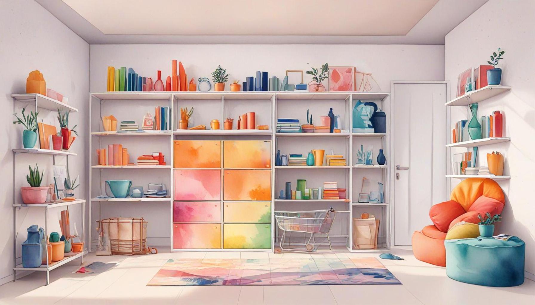
- Visibility: Bright colors, such as orange and vibrant red, catch the eye and can be strategically placed on storage items like cabinets or bins. These shades can help individuals easily locate their belongings, reducing the time spent searching for essentials, especially in high-traffic areas of the home.
- Contrast: Incorporating contrasting colors can help delineate different areas of storage. For example, dark cabinetry paired with lighter shelving can create a clean distinction, making it easier to navigate a minimalist space. This separation can streamline the user’s ability to quickly differentiate between various storage functions, enhancing overall efficiency.
- Enhancing Detailing: Utilizing muted tones can draw attention to architectural elements or unique storage features. For instance, a minimalistic white backdrop allows for wood or metal pegs in subdued gray to stand out. This approach not only adds visual interest but helps emphasize functionality without overwhelming the space.
Moreover, the psychological implications of colors don’t just stop at functionality; they extend to influence our emotional engagement with those spaces. When we find ourselves in a well-organized and visually appealing environment, we are more likely to feel a sense of achievement and satisfaction. This connection highlights the importance of a holistic approach to storage design.
Color Trends in Minimalist Storage Solutions
In recent years, certain color trends have risen to prominence that align perfectly with minimalist storage designs. Current popular shades include soft pastels, muted earth tones, and monochromatic schemes, each contributing to a cohesive and calming environment. The decision to incorporate these colors into storage design reflects a broader cultural shift towards creating functional areas that not only serve their purpose but also promote mental well-being and peace.
As the discussion on color psychology and storage design continues to evolve, it’s evident that the choices made today can lead to vibrant spaces that encourage organization and serenity simultaneously. By keenly observing how color influences our interactions with minimalist storage solutions, we can uncover a wealth of design opportunities that extend beyond traditional norms, ultimately redefining the way we engage with our living environments.
| Color Category | Psychological Impact |
|---|---|
| Blue | Promotes calmness and encourages organization, making it ideal for storage spaces. |
| Green | Symbolizes balance and harmony, fostering a serene environment conducive to efficient storage management. |
| Yellow | Elicits feelings of happiness and energy, which can motivate individuals to keep spaces tidy and organized. |
| Neutral Colors | Create a backdrop that allows for flexibility and focus, emphasizing the minimalist design of storage solutions. |
When analyzing the intricate relationship between color psychology and efficient storage design, understanding how different colors invoke specific emotions and behaviors becomes crucial. For instance, the use of blue in minimalist spaces can create a soothing atmosphere, helping individuals declutter their mental state, which translates into more organized physical spaces. This emotional calm can significantly enhance productivity and efficiency when managing storage. Moreover, incorporating green can introduce a sense of balance, essential in a minimalist design that often strives for harmony and tranquility. Such colors not only enhance aesthetic appeal but also contribute to a more effective storage experience. Contrastingly, the vibrance of yellow energizes a space, which may inspire individuals to maintain order, reinforcing the psychological link between color and behavior. The subtlety of neutral colors, on the other hand, enhances focus and versatility in design, a vital aspect in achieving minimalism while still allowing for functional and efficient storage solutions. By thoughtfully incorporating these colors, one can truly optimize both the design aesthetics and practical functionality of minimalist storage spaces.
DISCOVER MORE: Click here for effective storage tips
Choosing Colors for Enhanced User Experience
As we delve deeper into the nuances of color psychology in efficient storage design, it becomes increasingly vital to consider how color choices can shape the user experience within minimalist spaces. This intersection not only influences the functionality of storage solutions but also alters how individuals interact with their environment. By exploring the emotional and psychological effects of color, designers can create storage solutions that foster a sense of harmony and ease.
Color and Its Emotional Responses
Colors evoke emotional reactions that can significantly impact our daily lives. In minimalist spaces, where every element is intentionally chosen, the emotional resonance of color becomes even more crucial. For example, hues of blue are known for their calming effects and can inspire feelings of tranquility. In a minimalist storage area adorned with soft blue shades, individuals may experience reduced stress levels, ultimately enhancing their ability to organize and declutter. The positive associations linked to such colors can transform a simple storage solution into a sanctuary of serenity.
On the other hand, warmer colors like yellows and oranges can stimulate energy and creativity. These vibrant tones can be strategically used in areas designated for creative projects or hobbies, encouraging inspiration while still maintaining an organized environment. By thoughtfully incorporating colors that resonate with particular activities, designers can tailor storage solutions to better support the user’s needs and emotions.
Color Accessibility in Storage Design
Another critical factor to consider is the accessibility of color in storage design. High contrast is not just about aesthetics; it serves a function in ensuring that storage spaces are inclusive and user-friendly. For instance, colorblind individuals—or those who struggle with visual impairments—can benefit from designs that prioritize color completeness and clarity. Utilizing shades that contrast well without relying solely on color can create visually navigable spaces for all users, enhancing everyday interactions with storage.
Furthermore, utilizing textures alongside colors can also play a significant role in guiding users. For instance, matte finishes in subtle hues can evoke a sense of sophistication while also providing a tactile experience. Textured surfaces can guide touch, ensuring that consumers can easily discern which storage solutions are meant for practical use versus aesthetic appeal.
The Impact of Color on Perceived Space
In a minimalist environment, where reducing clutter is paramount, the perception of space can be dramatically affected by color choices. Light, airy colors, such as whites and pastels, can create an illusion of larger surroundings, an important consideration in small apartments or compact areas. By employing these lighter hues in storage units—such as cabinets or floating shelves—designers can maintain a sense of openness while keeping vital items organized and within reach.
Conversely, darker tones can lend a sense of coziness and intimacy, perfect for areas intended for relaxation. For example, rich navy or deep forest green can be incorporated into closed storage units to create calming cocoon-like spaces. This layered approach to color usage provides not just a means of organization, but also an emotional engagement that makes minimalist spaces feel more inviting.
Ultimately, the adept integration of color in storage design extends beyond aesthetic appeal; it is about creating emotional connections and fostering practicality within minimalist environments. As color psychology continues to gain recognition, it opens up a myriad of possibilities that challenge traditional approaches to storage solutions, revealing innovative pathways toward improving both functionality and personal well-being.
DISCOVER MORE: Click here to enhance your intentional living
Conclusion: The Transformative Power of Color in Storage Design
In the realm of efficient storage design, particularly within minimalist spaces, the application of color psychology emerges as a pivotal element that influences not only aesthetic appeal but also functionality and emotional well-being. The choices designers make regarding color can profoundly shape how users experience their environments, impacting factors such as organization, creativity, and overall tranquility.
By understanding and leveraging the emotional responses elicited by various colors, designers can create storage solutions that not only meet practical needs but also foster a sense of calm or stimulation depending on the intended use of the space. The careful balance of light and dark hues can transform the perception of dimensions, making even the smallest areas feel open yet intimate. Moreover, accessibility considerations ensure that these designed spaces are navigable for all individuals, emphasizing the inclusivity that color can promote.
As we continue to explore the integration of color psychology in storage design, it becomes clear that the implications extend beyond mere visual aesthetics. They touch upon the essence of how we interact with our surroundings, encouraging a more organized, serene, and engaging lifestyle. In embracing the power of color, we unveil a fresh perspective on minimalist design, one that harmonizes form and function while enhancing personal well-being and user satisfaction. The future of storage design lies in its ability to create meaningful connections through color, inviting us to rethink the spaces we inhabit.
Related posts:
Creating a Capsule Storage System: Essentials for a Clutter-Free Lifestyle
Tech Meets Minimalism: Smart Storage Solutions for the Modern Home
Efficient Storage for Travelers: Minimalist Packing Strategies for a Streamlined Journey
The Role of Multi-Functional Furniture in Efficient Storage for Minimalist Living
Efficient Storage Strategies to Minimize Waste in Small Spaces
The Art of Decluttering: Efficient Storage Solutions for a Minimalist Home

Linda Carter is a writer and organization expert specializing in minimalism and personal organization. With extensive experience helping individuals create clutter-free, functional spaces and adopt mindful habits, Linda shares her knowledge on our platform. Her goal is to empower readers with practical advice and strategies to simplify their lives, stay organized, and achieve a sense of calm and balance in their daily routines.